Quantcast
Channel: Advanced Dimension Patterns & Case Studies – Kimball Group
Viewing all 17 articles
Browse latest View live

Design Tip #113 Creating, Using, and Maintaining Junk Dimensions

$
0
0
Note: There is a print link embedded within this post, please visit this post to print it.

A junk dimension combines several low-cardinality flags and attributes into a single dimension table rather than modeling them as separate dimensions. There are good reasons to create this combined dimension, including reducing the size of the fact table and making the dimensional model easier to work with. Margy described junk dimensions in detail in Kimball Design Tip #48: De-Clutter with Junk (Dimensions). On a recent project, I addressed three aspects of junk dimension processing: building the initial dimension, incorporating it into the fact processing, and maintaining it over time.

Build the Initial Junk Dimension
If the cardinality of each attribute is relatively low, and there are only a few attributes, then the easiest way to create the dimension is to cross-join the source system lookup tables. This creates all possible combinations of attributes, even if they might never exist in the real world.

If the cross-join of the source tables is too big, or if you don’t have source lookup tables, you will need to build your junk dimension based on the actual attribute combinations found in the source data for the fact table. The resulting junk dimension is often significantly smaller because it includes only combinations that actually occur.

We’ll use a simple health care example to show both of these combination processes. Hospital admissions events often track several standalone attributes, including the admission type and level of care required, as illustrated below in the sample rows from the source system lookup and transaction tables.

The following SQL uses the cross-join technique to create all 12 combinations of rows (4×3) from these two source tables and assign unique surrogate keys.

SELECT ROW_NUMBER() OVER( ORDER BY Admit_Type_ID, Care_Level_ID) AS
Admission_Info_Key,
Admit_Type_ID, Admit_Type_Descr, Care_Level_ID, Care_Level_Descr
FROM Admit_Type_Source
CROSS JOIN Care_Level_Source;

In the second case, when the cross-join would yield too many rows, you can create the combined dimension based on actual combinations found in the transaction fact records. The following SQL uses outer joins to prevent a violation of referential integrity when a new value shows up in a fact source row that is not in the lookup table.

SELECT ROW_NUMBER() OVER(ORDER BY F.Admit_Type_ID) AS
Admission_Info_Key,
F.Admit_Type_ID, ISNULL(Admit_Type_Descr, ‘Missing Description’)
Admit_Type_Descr,
F.Care_Level_ID, ISNULL(Care_Level_Descr, ‘Missing Description’)
Care_Level_Descr — substitute NVL() for ISNULL() in Oracle
FROM Fact_Admissions_Source F
LEFT OUTER JOIN Admit_Type_Source C ON
F.Admit_Type_ID = C.Admit_Type_ID
LEFT OUTER JOIN Care_Level_Source P ON
F.Care_Level_ID = P.Care_Level_ID;

Our example Fact_Admissions_Source table only has four rows which result in the following Admissions_Info junk dimension. Note the Missing Description entry in row 4.

Incorporate the Junk Dimension into the Fact Row Process
Once the junk dimension is in place, you will use it to look up the surrogate key that corresponds to the combination of attributes found in each fact table source row. Some of the ETL tools do not support a multi-column lookup join, so you may need to create a work-around. In SQL, the lookup query would be similar to the second set of code above, but it would join to the junk dimension and return the surrogate key rather than joining to the lookup tables.

Maintain the Junk Dimension
You will need to check for new combinations of attributes every time you load the dimension. You could apply the second set of SQL code to the incremental fact rows and select out only the new rows to be appended to the junk dimension as shown below.

SELECT * FROM ( {Select statement from second SQL code listing} ) TabA
WHERE TabA.Care_Level_Descr = ‘Missing Description’
OR TabA.Admit_Type_Descr = ‘Missing Description’ ;

In this example, it would select out row 4 in the junk dimension. Identifying new combinations could be done as part of the fact table surrogate key substitution process, or as a separate dimension processing step prior to the fact table process. In either case, your ETL system should raise a flag and notify the appropriate data steward if it identifies a missing entry.

There are a lot of variations on this approach depending on the size of your junk dimension, the sources you have, and the integrity of their data, but these examples should get you started. Send me an email if you’d like a copy of the code to create this example in SQL Server or Oracle.

The post Design Tip #113 Creating, Using, and Maintaining Junk Dimensions appeared first on Kimball Group.


Five Alternatives for Better Employee Dimension Modeling

$
0
0
Note: There is a print link embedded within this post, please visit this post to print it.

The employee dimension presents one of the trickier challenges in data warehouse modeling. These five approaches ease the complication of designing and maintaining a ‘Reports To’ hierarchy for ever-changing reporting relationships and organizational structures.

Most enterprise data warehouses will eventually include an Employee dimension. This dimension can be richly decorated, including not only name and contact information, but also job-related attributes such as job title, departmental cost codes, hire dates, even salary-related information. One very important attribute of an employee is the identity of the employee’s manager. For any manager, we’d like to work down the Reports To hierarchy, finding activity for her direct reports or her entire organization. For any employee, we’d like to work up the hierarchy, identifying his entire management chain. This Reports To hierarchy presents significant design and management challenges to the unwary. This article describes approaches for including this relationship in a dimensional model. The Employee Dimension.

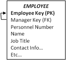
The basic structure of the Employee dimension is shown in Figure 1. The unique feature of a Reports To hierarchy is that a manager is also an employee, so Employee has a foreign key reference to itself, from Manager Key to Employee Key.


Figure 1: Basic structure of the Employee dimension and Reports To hierarchy

Someone new to dimensional modeling might leave the table as it is currently designed as the Manager/Employee relationship is fully described. Assuming you can populate the table, this design will work if an OLAP environment is used to query the data. Popular OLAP tools contain a Parent-Child hierarchy structure that works smoothly and elegantly against a variable-depth hierarchy modeled as shown here. This is one of the strengths of an OLAP tool.

However, if you want to query this table in the relational environment, you’d have to use a CONNECT BY syntax. This is very unattractive and probably unworkable:

  • Not every SQL engine supports CONNECT BY.
  • Even SQL engines that support CONNECT BY may not support a GROUP BY in the same query.
  • Not every ad hoc query tool supports CONNECT BY.

Alternative 1: Bridge Table using Surrogate Keys

The classic solution to the Reports To or variable-depth hierarchy problem is a bridge table technique described in The Date Warehouse Toolkit (Wiley 2002), p.162-168 and illustrated by Figure 2. The same Employee dimension table as above relates to the fact table through a bridge table.

Figure 2: Classic relational structure for a Reports To hierarchy

The Reports To Bridge table contains one row for each pathway from a person to any person below him in the hierarchy, both direct and indirect reports, plus an additional row for his relationship to himself. This structure can be used to report on each person’s activity; the activity of their entire organization; or activity down a specified number of levels from the manager.

There are several minor disadvantages to this design:

  • The bridge table is somewhat challenging to build.
  • The bridge table has many rows in it, so query performance can suffer.
  • The user experience is somewhat complicated for ad hoc use, though we’ve seen many analysts use it effectively.
  • In order to drill up — to aggregate information up rather than down a management chain — the join paths have to be reversed.

The major challenge comes when we want to manage Employee and the Reports To hierarchy as a Type 2 dimension — a dimension for which we are tracking history rather than updating in place. This bridge table would still work in theory; the problem is the explosion of Employee and Reports To Bridge records to track the changes.

To understand the problem, look back at Figure 1 and think about it as a Type 2 dimension for a medium-sized company with 20,000 employees. Imagine that the CEO — the top of the hierarchy — has 10 senior VPs reporting to her. Let’s give her a Type 2 change that generates a new row and hence a new Employee Key. Now, how many employees are pointing to her as their manager? It’s a brand new row, so of course no existing rows point to it; we need to propagate 10 new Type 2 rows for each of the senior VPs. The change ripples through the entire table. We end up replicating the complete Employee table because of one attribute change in one row. Even aside from the obvious implication of data volume explosion, simply teasing apart the logic of which rows need to be propagated is an ETL nightmare.

Alternative 2: Bridge Table with Separate Reports To Dimension

Tracking the history of changes in a variable depth hierarchy such as an employee Reports To hierarchy is especially challenging when the hierarchy changes are intermingled with other Type 2 changes in the dimension. An obvious solution is to separate the Employee dimension from the Reports To relationship. Simplify Employee by removing the self-referencing relationship, and create a new Reports To dimension, as illustrated in Figure 3.

Figure 3: Separate Employee and Reports To (or Job) dimensions

The key elements that distinguish this design from the classic structure are:

  • Eliminate the surrogate key for manager from the Employee dimension, and hence the recursive foreign key relationship.
  • The Reports To dimension has very few columns: surrogate keys, personnel numbers, and names. The only Type 2 attribute is possibly the Manager Position Number.
  • If you’re exclusively using OLAP to query the schema, the bridge table is unnecessary.

If the business users don’t need to track changes in the full reports-to hierarchy, this solution works neatly. Employee is a Type 2 dimension. We see the name of each employee’s manager. If Employee.ManagerName is managed as Type 2 we can easily see the names of all past bosses from the Employee dimension. If Reports To is managed as Type 1 – we’re not tracking changes in the reporting structure – it is no more difficult to populate and maintain than in the classic solution.

If the business users absolutely must see the history of the reporting relationship, this solution will be challenging. We’ve simplified the management problem by separating out the Reports To and Employee dimensions, but if we get a major organizational change we’re still going to have to propagate a lot of new rows in both Reports To and the bridge table.

Alternative 3: Bridge Table with Natural Keys

In order to track changes in a Reports To hierarchy for anything other than trivial data volumes, we need a solution that does not use surrogate keys. The classic structure described in Figure 2 works fine at query time, but it’s a maintenance challenge. Our natural key alternative is illustrated in Figure 4.

Figure 4: Tracking history in the reports-to relationship with a natural key bridge table

The key elements of this design relative to the classic structure of Alternative 1 are:

  • Eliminate the surrogate key for manager from the Employee dimension, and hence the recursive foreign key relationship.
  • Include the Employee dimension twice in the schema, once as the employee (linked directly to the fact table), and once as the manager (linked via the bridge table). The Manager dimension table is simply a database view of the Employee dimension.
  • The bridge table is built on employee numbers – the natural key carried in the source systems – rather than the data warehouse surrogate keys. It’s like the classic bridge table except that we need start and end dates to uniquely identify each row.
  • The propagation of new rows in the bridge table is substantially fewer than before since new rows are added when reporting relationships change, not when any Type 2 employee attribute is modified (as in Figure 2). A bridge table built on natural keys is an order of magnitude easier to manage – though still quite challenging.

A primary design goal is to be able to find all the fact rows associated with a manager and her entire organization, as the organization was structured at the time of the event measured in the fact table. This is a complicated query:

  • From the Manager view of the Employee dimension, find the manager we’re interested in.
  • Join to the bridge table to find the personnel numbers and row dates for the employees in her organization.
  • Join again to the Employee dimension to find the surrogate Employee Key for the people in the organization.
  • Finally, join to the fact table to pick up all facts associated with these employees.
  • The joins to the Bridge table and Manager view of Employee must constrain to pick up only the one row that’s in effect as of the time of the fact transaction.

SELECT Manager.ManagerName, Employee.EmployeeName, SUM(FactTable.SomeFact) AS OrganizationalSum

FROM FactTable

INNER JOIN Employee  — standard dimensional join

       ON (FactTable.EmployeeKey = Employee.EmployeeKey)

INNER JOIN NKBridge  — needs a date constraint

       ON (Employee.PersonnelNum = Bridge.PersonnelNum

       AND Fact.DateKey BETWEEN Bridge.RowStartDate and Bridge.RowEndDate)

INNER JOIN Manager  — needs a date constraint

       ON (Bridge.MgrPersonnelNum = Manager.MgrPersonnelNum

       AND Fact.DateKey BETWEEN Manager.RowStartDate AND Manager.RowEndDate)

WHERE Manager.ManagerName = ‘Name of specific person’

GROUP BY Manager.ManagerName, Employee.EmployeeName

The natural key bridge table approach is unwieldy. Its main advantage is that it’s feasible to maintain. It also avoids breaking out the reporting relationship into a separate dimension, as in Alternative2. Any queries that don’t involve the Reports To structure can drop the bridge table and Manager dimension view. Disadvantages include:

  • Query performance is a concern as the queries are complex and the bridge table will grow quite large over time.
  • The technique is not appropriate for broad ad hoc use. Only a tiny percentage of power users could ever hope to master the complex query structure.
  • The technique relies on dynamic “date-bracketed” joins between the tables, and hence cannot be implemented in OLAP technology.

Alternative 4: Forced Fixed Depth Hierarchy Technique

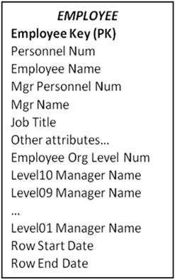
It is tempting to force the structure into a fixed depth hierarchy. Even a very large company probably has fewer than 15-20 layers of management, which would be modeled as 15-20 additional columns in the Employee dimension. You’ll need to implement a method of handling the inevitable future exceptions. A fixed depth employee dimension table is illustrated in Figure 5.

Figure 5: Forced fixed depth reports to hierarchy

The Employee Org Level Number tells us what level from the top of the hierarchy we’ll find this employee. Usually we fill in the lower levels with the employee’s name.

At query time, the forced fixed depth hierarchy approach will work smoothly with both relational and OLAP data access. The biggest awkwardness is to train the users to query the Org Level Number first to find out the level where the employee is located – for example Level 5 – and then constrain on that column (Level05 Manager Name). A design that uses this approach must very carefully evaluate whether this two step query procedure is actually workable with a particular query tool and consider the training costs for the business users. Query performance should be substantially better than designs that include a bridge table.

The forced fixed depth approach is maintainable, but you will see a lot of propagation of Type 2 rows. If the entire fixed depth hierarchy is managed as Type2, then a new CEO (Level01 Manager) would result in a new row for every employee. Some organizations compromise by managing the top several levels as Type1.

Alternative 5: The PathString Attribute

By now the readers are probably desperate for a recommendation. Two years ago, a clever student in a Kimball University modeling class described an approach that allows complex ragged hierarchies to be modeled without needing to use a bridge table. Furthermore, this approach avoids the Type 2 SCD explosion described in Alternative #1, and it works equally well in both OLAP and ROLAP environments.

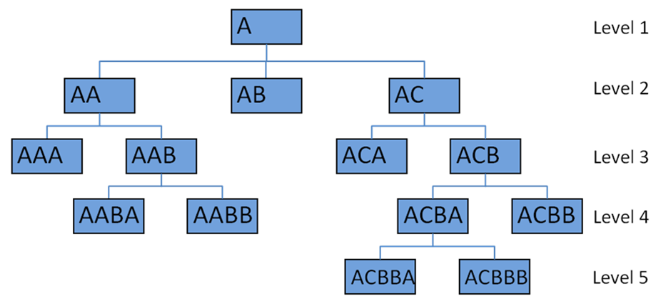
The PathString attribute is a field in the Employee dimension that contains an encoding of the path from the supreme top level manager down to the specific employee. At each level of the hierarchy, the nodes are labeled left to right as A, B, C, D, etc. and the entire path from the supreme parent is encoded in the PathString attribute. Every employee has a PathString attribute. The supreme top level manager has a PathString value of “A”. The “A” indicates that this employee is the left most (and only) employee at that level. Two additional columns would hold the level number, and an indicator of whether the employee is a manager or an individual contributor. Figure 6 shows a sample organization chart with PathString values for each node.


Figure 6: Sample org chart with PathString values

Users query the tree by creating a filter condition on the PathString column in the Employee dimension. For example, we can find all the people who report (directly or indirectly) to the employee with PathString ACB by filtering WHERE PathString LIKE ‘ACB%’. We can find direct reports by adding a clause AND OrgLevel = 4.

The advantage of the PathString approach is its maintainability. Because of this clever structure, you will see substantially fewer Type 2 rows cascading through the dimension. An organizational change high in the tree – such as creating a new VP organization and moving many people from one node to another – will result in a substantial restatement of the tree. If you’re tracking the organizational structure itself as Type 2, this would mean many new rows in the employee dimension. But it’s still fewer rows than the alternative approaches.

The main disadvantage of the PathString approach is the awkwardness of the business user query experience. This solution will require substantial marketing and education of the user community for it to be palatable.

Recommendation

Hopefully when you study these alternatives, you will see one that meets your needs. A Type2 “reports to” or variable depth hierarchy is a challenging beast to include in your DW/BI design. This is particularly true if you want to support ad hoc use of the structure, because you’ll need to balance ease of use and query performance against some very difficult maintenance problems. The decision matrix is complicated by the different capabilities of alternative storage engines, especially the differences between relational and OLAP.

The sad conclusion is that there is no universally great solution to the problem. In order to craft the best solution, you need to have a deep understanding of both your data and your business users’ requirements. We always strive for that understanding, but in this case, it’s imperative.

The post Five Alternatives for Better Employee Dimension Modeling appeared first on Kimball Group.

Design Tip #117 Dealing with Data Quality: Don’t Just Sit There, Do Something!

$
0
0
Note: There is a print link embedded within this post, please visit this post to print it.

Most data quality problems can be traced back to the data capture systems because, historically, they have only been responsible for the level of data quality needed to support transactions. What works for transactions often won’t work for analytics. In fact, many of the attributes we need for analytics are not even necessary for the transactions, and therefore capturing them correctly is just extra work. By requiring better data quality as we move forward, we are requiring the data capture system to meet the needs of both transactions and analytics. Changing the data capture systems to get better data quality is a long term organizational change process. This political journey is often paralyzing for those of us who didn’t expect to be business process engineers in addition to being data warehouse engineers!

Do not let this discourage you. You can take some small, productive steps in the short term that will get your organization on the road to improving data quality.

Perform Research
The earlier you identify data quality problems, the better. It will take much more time if these problems only surface well into the ETL development task, or worse, after the initial rollout. And it will tarnish the credibility of the DW/BI system (even though it’s not your fault).

Your first pass at data quality research should come as part of the requirements definition phase early in the lifecycle. Take a look at the data required to support each major opportunity. Initially, this can be as simple as a few counts and ratios. For example, if the business folks wanted to do geographic targeting, calculating the percentage of rows in the customer table where the postal code is NULL might be revealing. If 20 percent of the rows don’t have a postal code, you have a problem. Make sure you include this information in the requirements documentation, both under the description of each opportunity that is impacted by poor data quality, and in a separate data quality section.

The next opportunity for data quality research is during the dimensional modeling process. Defining each attribute in each table requires querying the source systems to identify and verify the attribute’s domain (the list of possible values the attribute can have). You should go into more detail at this point, investigating relationships among columns, such as hierarchies, referential integrity with lookup tables, and the definition and enforcement of business rules.

The third major research point in the lifecycle is during the ETL system development. The ETL developer must dig far deeper into the data and often discovers more issues.

A data quality / data profiling tool can be a big help for data quality research. These tools allow you to do a broad survey of your data fairly quickly to help identify questionable areas for more detailed investigation. However, if you don’t have a data quality tool in place, don’t stop your research until you find the best tool and the funds to purchase it. Simple SQL statements like:

SELECT PostalCode, COUNT(*) AS RowCount
FROM Dim_Customer GROUP BY PostalCode ORDER BY 2 DESC;

will help you begin to identify anomalies in the data immediately. You can get more sophisticated later, as you generate awareness and concern about data quality.

It’s a good idea to include the source systems folks in the research process. If they have a broader sense of responsibility for the data they collect, you may be able to get them to adjust their data collection processes to fix the problems. If they seem amenable to changing their data collection processes, it is a good idea to batch together as many of your concerns as possible while they are in a good mood. Source systems folks often aren’t happy at updating and testing their code too frequently. Don’t continuously dribble little requests to them!

Share Findings
Once you have an idea of the data quality issues you face, and the analytic problems they will cause, you need to educate the business people. Ultimately, they will need to re-define the data capture requirements for the transaction systems and allocate additional resources to fix them. They won’t do this unless they understand the problems and associated costs.

The first major chance to educate on data quality problems is as part of the opportunity prioritization session with senior management. You should show examples of data quality problems, explain how they are created, and demonstrate their impact on analytics and project feasibility. Explain that you will document these in more detail as part of the modeling process, and at that point you can reconvene to determine your data quality strategy. Set the expectation that this is work and will require resources.

The dimensional modeling process is the second major education opportunity. All of the issues you identify during the modeling process should be discussed as part of documenting the model, and an approach to remedying the problem should be agreed upon with key business folks.

At some point, you should have generated enough awareness and concern to establish a small scale
data governance effort which will become the primary research and education channel for data quality.

Conclusion
Improving data quality is a long, slow educational process of teaching the organization about what’s wrong with the data, the cost in terms of accurate business decision making, and how best to fix it. Don’t let it overwhelm you. Just start with your highest value business opportunity and dive into the data.

The post Design Tip #117 Dealing with Data Quality: Don’t Just Sit There, Do Something! appeared first on Kimball Group.
Design Tip #118 Managing Backlogs Dimensionally

$
0
0
Note: There is a print link embedded within this post, please visit this post to print it.

Certain industries need the ability to look at a backlog of work, and project that backlog into the future for planning purposes. The classic example is a large services organization with multi-month or multiyear contracts representing a large sum of future dollars to be earned and/or hours to be worked. Construction companies, law firms and other organizations with long term projects or commitments have similar requirements. Manufacturers that ship against standing blanket orders may also find this technique helpful.

Backlog planning requirements come in several flavors supporting different areas of the organization. Finance needs to understand future cash flow in terms of expenditures and cash receipts, and properly project both invoiced and recognized revenue for management planning and expectation setting. There are operational requirements to understand the flow of work for manpower, resource management and capacity planning purposes. And the sales organization will want to understand how the backlog will ultimately flow to understand future attainment measures.

Dimensional schemas can be populated when a new contract is signed, capturing the initial acquisition or creation of the contract and thus the new backlog opportunity. In addition, another schema can be created that captures the work delivered against the contract over time. These two schemas are interesting and useful, but by themselves are not enough to support the future planning requirements. They show that the organization has “N” number of contracts worth “X” millions of dollars with “Y” millions of dollars having been delivered. From these two schemas, the current backlog can be identified by subtracting the delivered amount from the contracted amount. Often it is worthwhile to populate the backlog values in another schema as the rules required to determine the remaining backlog may be relatively complex. Once the backlog amount is understood, it then needs to be accurately projected into the future based on appropriate business rules.

The use of another schema we call the “spread” fact table is helpful in supporting the planning requirements. The spread fact table is created from the backlog schema discussed above. The backlog and remaining time on the contract are evaluated and the backlog is then spread out into the appropriate future planning time buckets and rows are inserted into the fact table. For this discussion we’ll assume monthly time periods, but it could just as easily be daily, weekly or quarterly. Thus the grain of our spread fact table will be at the month by contract (whatever is the lowest level used in the planning process). This schema will also include other appropriate conformed dimensions such as customer, product, sales person, and project manager. In our example, the interesting metrics might include the number of hours to be worked, as well as the amount of the contract value to be delivered in each future month.

In addition, we include another dimension called the scenario dimension. The scenario dimension describes the planning scenario or version of the spread fact table’s rows. This may be a value such as “2009 October Financial Plan” or “2009 October Operational Plan.” Thus, if we plan monthly, there will be new rows inserted into the spread fact table each month described by a new row in the scenario dimension. The secret sauce of the spread fact table is the business rules used to break down the backlog value into the future spread time buckets. Depending on the sophistication and maturity of the planning process, these business rules may simply spread the backlog into equal buckets based on the remaining months in the contract. In other organizations, more complex rules may be utilized that evaluate a detailed staffing and work plan incorporating seasonality trends using a complex algorithm to calculate a very precise amount for each future time period in the spread fact table.

By creatively using the scenario dimension, it is possible to populate several spreads each planning period based on different business rules to support different planning assumptions. As indicated in the scenario descriptions above, it may be possible that the financial planning algorithms are different than the operational planning algorithms for a variety of reasons.

The spread fact table is not just useful for understanding the backlog of actual work. Similar planning requirements often surface with other business processes. Another example is planning for sales opportunities that are proposed but have not yet been signed. Assuming the organization has an appropriate source for the future sales opportunities, this would be another good fit for a spread fact table. Again, appropriate business rules need to be identified to evaluate a future opportunity and determine how to spread the proposed contract amounts into the appropriate future periods. This schema can also include indicators that describe the likelihood of winning the opportunity, such as forecast indicators and percent likely to close attributes. These additional attributes will enable the planning process to look at best case/worst case future scenarios. Typically, the sales opportunities spread fact table will need to be populated as a separate fact table than the actual backlog spread as the dimensionality between the two fact tables is typically quite different. A simple drill across query will enable the planning process to align the solid backlog along with the softer projected sales opportunities to paint a more complete picture of what the future may hold for the organization.

The post Design Tip #118 Managing Backlogs Dimensionally appeared first on Kimball Group.
Design Tip #124 Alternatives for Multi-valued Dimensions

$
0
0
Note: There is a print link embedded within this post, please visit this post to print it.

The standard relationship between fact and dimension tables is many-to-one: each row in a fact table links to one and only one row in the dimension table. In a detailed sales event fact table, each fact table row represents a sale of one product to one customer on a specific date. Each row in a dimension table, such as a single customer, usually points back to many rows in the fact table.

A dimensional design can encompass a more complex multi-valued relationship between fact and dimension. For example, perhaps our sales order entry system lets us collect information about why the customer chose a specific product (such as price, features, or recommendation). Depending on how the transaction system is designed, it’s easy to see how a sales order line could be associated with potentially many sales reasons.

The robust, fully-featured way to model such a relationship in the dimensional world is similar to the modeling technique for a transactional database. The sales reason dimension table is normal, with a surrogate key, one row for each sales reason, and potentially several attributes such as sales reason name, long description, and type. In our simple example, the sales reason dimension table would be quite  small, perhaps ten rows. We can’t put that sales reason key in the fact table because each sales transaction can be associated with many sales reasons. The sales reason bridge table fills the gap. It ties together all the possible (or observed) sets of sales reasons: {Price, Price and Features, Features and Recommendation, Price and Features and Recommendation}. Each of those sets of reasons is tied together with a single sales reason group key that is propagated into the fact table.

For example, the figure below displays a dimensional model for a sales fact that captures multiple sales reasons:

If we have ten possible sales reasons, the Sales Reason Bridge table will contain several hundred rows.

The biggest problem with this design is its usability by ad hoc users. The multi-valued relationship, by its nature, effectively “explodes” the fact table. Imagine a poorly trained business user who attempts to construct a report that returns a list of sales reasons and sales amounts. It is absurdly easy to double count the facts for transactions with multiple sales reasons. The weighting factor in the bridge table is designed to address that issue, but the user needs to know what the factor is for and how to use it.

In the example we’re discussing, sales reason is probably a very minor embellishment to a key fact table that tracks our sales. The sales fact table is used throughout the organization by many user communities, for both ad hoc and structured reporting. There are several approaches to the usability problem presented by the full featured bridge table design. These include:

• Hide the sales reason from most users. You can publish two versions of the schema: the full one for use by structured reporting and a handful of power users, and a version that eliminates sales reason for use by more casual users.
• Eliminate the bridge table by collapsing multiple answers. Add a row to the sales reason dimension table: “Multiple reasons chosen.”

The fact table can then link directly with the sales reason dimension. As with all design decisions, the IT organization cannot choose this approach without consulting with the user community. But you may be surprised to hear how many of your users would be absolutely fine with this approach. We’ve often heard users say “oh, we just collapse all multiple answers to a single one in Excel anyway.” For something like a reason code (which has limited information value), this approach may be quite acceptable.

One way to make this approach more palatable is to have two versions of the dimension structure, and two keys in the fact table: the sales reason group key and the sales reason key directly. The view of the schema that’s shared with most casual users displays only the simple relationship; the view for the reporting team and power users could also include the more complete bridge table relationship.

• Identify a single primary sales reason. It may be possible to identify a primary sales reason, either based on some logic in the transaction system or by way of business rules. For example, business users may tell you that if the customer chooses price as a sales reason, then from an analytic point of view, price is the primary sales reason. In our experience it’s relatively unlikely that you can wring a workable algorithm from the business users, but it’s worth exploring. As with the previous approach, you can combine this technique with the bridge table approach for different user communities.
• Pivot out the sales reasons. If the domain of the multi-choice space is small — in other words, if you have only a few possible sales reasons — you can eliminate the bridge table by creating a dimension table with one column for each choice. In the example we’ve been using, the sales reason dimension would have columns for price, features, recommendation, and each other sales reason. Each attribute can take the value yes or no. This schema is illustrated below:

This approach solves the fact table explosion problem, but does create some issues in the sales reason dimension. It’s only practical with a relatively small number of domain values, perhaps 50 or 100. Every attribute in the original dimension shows up as an additional column for each domain value. Perhaps the biggest drawback is that any change in the domain (adding another
sales reason) requires a change in the data model and ETL application.

Nonetheless, if the multi-valued dimension is important to the broad ad hoc user community, and you have a relatively small and static set of domain values, this approach may be more appealing than the bridge table technique. It’s much easier for business users to construct meaningful queries.

Clearly the pivoted dimension table doesn’t work for all multi-valued dimensions. The classic example of a multi-valued dimension — multiple diagnoses for a patient’s hospital visit — has far too large a domain of possible values to fit in the pivoted structure.

The bridge table design approach for multi-valued dimensions, which Kimball Group has described many times over the past decades, is still the best. But the technique requires an educated user community, and user education seems to be one of the first places the budget cutting axe is applied. In some circumstances, the usability problems can be lessened by presenting an alternative, simpler structure to the ad hoc user community.

The post Design Tip #124 Alternatives for Multi-valued Dimensions appeared first on Kimball Group.

Extreme Status Tracking For Real Time Customer Analysis

$
0
0
Note: There is a print link embedded within this post, please visit this post to print it.

We live in a world of extreme status tracking, where our customer-facing processes are capable of producing continuous updates on the transactions, locations, online gestures, and even the heartbeats of customers. Marketing folks and operational folks love this data because real-time decisions can be made to communicate with the customer. They expect these communications to be driven by a hybrid combination of traditional data warehouse history and up-to-the-second status tracking. Typical communications decisions include whether to recommend a product or service, or judge the legitimacy of a support request, or contact the customer with a warning.

As designers of integrated enterprise data warehouses (EDWs) with many customer-facing processes, we must deal with a variety of source operational applications that provide status indicators or data-mining-based behavioral scores we would like to have as part of the overall customer profile. These indicators and scores can be generated frequently, maybe even many times per day; we want a complete history that may stretch back months or even years. Though these rapidly changing status indicators and behavior scores are logically part of a single customer dimension, it is impractical to embed these attributes in a Type 2 slowly changing dimension. Remember that Type 2 perfectly captures history, and requires you to issue a new customer record each time any attribute in the dimension changes. Kimball Group has have long pointed out this practical conflict by calling this situation a “rapidly changing monster dimension.” The solution is to reduce the pressure on the primary customer dimension by spawning one or more “mini-dimensions” that contain the rapidly changing status or behavioral attributes. We have talked about such mini-dimensions for at least a decade.

In our real-time, extreme status tracking world, we can refine the tried-and-true mini-dimension design by adding the following requirements. We want a “customer status fact table” that is…

  • a single source that exposes the complete, unbroken time series of all changes to customer descriptions, behavior, and status;
  • minutely time-stamped to the second or even the millisecond for all such changes;
  • scalable, to allow new transaction types, new behavior tags, and new status types to be added constantly, and scalable to allow a growing list of millions of customers each with a history of thousands of status changes;
  • accessible, to allow fetching the current, complete description of a customer and then quickly exposing that customer’s extended history of transactions, behavior and status; and
  • usable as the master source of customer status for all fact tables in the EDW.

Our recommended design is the Customer Status Fact table approach shown in the figure below.

Kimball U

The Customer Status Fact table records every change to customer descriptions, behavior tags, and status descriptions for every customer. The transaction date dimension is the calendar date of the change and provides access to the calendar machinery that lets an application report or constrain on complex calendar attributes such as holidays, fiscal periods, day numbers, and week numbers.

The customer dimension contains relatively stable descriptors of customers, such as name, address, customer type, and date of first contact. Some of the attributes in this dimension will be Type 2 SCD (slowly changing dimension) attributes that will add new records to this dimension when they change, but the very rapidly changing behavior and status attributes have been removed to mini-dimensions. This is the classic response to a rapidly changing monster dimension. The Most Recent Flag is a special Type 1 field that is set to True only for the current valid customer record. All prior records for a given customer have this field set to False.

The customer durable key is what we normally designate as the natural key, but we call it durable to emphasize that the EDW must guarantee that it never changes, even if the source system has a special business rule that can cause it to change (such as an employee number that is re-assigned if the employee resigns and then is rehired). The durable key can be administered as a meaningless, sequentially assigned integer surrogate key in those cases where more than one source system provides conflicting or poorly administered natural keys. The point of the durable key is for the EDW to get control of the customer keys once and for all.

The customer surrogate key is definitely a standard surrogate key, sequentially assigned in the EDW back room every time a new customer record is needed, either because a new customer is being loaded or because an existing customer undergoes a Type 2 SCD change.

The double-dashed join lines shown in the figure are a key aspect of extreme status processing. When a requesting application sets the most recent flag to True, only the current profiles are seen. The customer surrogate key allows joining to the status fact table to grab the precise current behavior tags and status indicators. In a real-time environment, this is the first step in determining how to respond to a customer. But the customer durable key can then be used as an alternate join path to instantly expose the complete history of the customer we have just selected. In a real-time environment, this is the second step in dealing with the customer. We can see all the prior behavior tags and status indicators. We can compute counts and time spans from the customer status fact table.

The behavior dimension can be modeled in two ways. The simpler design is a wide dimension with a separate column for each behavior tag type. Perhaps these behavior tags are assigned by data mining applications that monitor the customer’s behavior. If the number of behavior tag types is small (less than 100), this design works very well because query and report applications can discover and use the types at run time. New behavior tag types (and thus new columns in the behavior dimension) can be added occasionally without invalidating existing analysis applications.

A more complex behavior dimension design is needed when a very large and messy set of behavior descriptors is available. Perhaps you have access to a number of demographic data sources covering complicated overlapping subsets of your customer base. Or perhaps you have account application data containing financial asset information that is very interesting but can be described in many ways. In this case, you will need a dimensional bridge table. Kimball Group has described dimensional bridge table designs in previous articles. Search for “bridge tables” (in quotes) at www.kimballgroup.com.

The status dimension is similar to the behavior dimension but can probably always be a wide dimension with a separate column for each status type, simply because this dimension is more under your internal control than the behavior dimension.

The transaction dimension describes what provoked the creation of the new record in the customer status fact table. Transactions can run the gamut from conventional purchase transactions all the way to changes in any of the customer-oriented dimensions, including customer, behavior and status. The transaction dimension can also contain special priority or warning attributes that alert applications to highly significant changes somewhere in the overall customer profile.

The begin and end effective date/times are ultra-precise, full-time stamps for when the current transaction became effective and when the next transaction became effective (superseding the current one). Kimball Group has given a lot of thought to these ultra-precise time stamps and we recommend the following design:

  • The grain of the time stamps should be as precise as your DBMS allows, at least down to the individual second. Some day in the future, you may care about time stamping some behavioral change in such a precise way.
  • The end effective time stamp should be exactly equal to the begin time stamp of the next (superseding) transaction, not “one tick” less. You need to have a perfect unbroken set of records describing your customer without any possibility of miniscule gaps because of your choice of a “tick”.
  • In order to find a customer profile at a specific point in time, you won’t be able to use BETWEEN syntax because of the preceding point. You will need something like:
#Nov 2, 2009: 6:56:00# >= BeginEffDateTime and #Nov 2, 2009: 6:56:00# < EndEffDateTime 
as your constraint, where Nov 2, 2009, 6:56am is the desired point in time.

The customer status fact table is the master source for the complete customer profile, gathering together standard customer information, behavior tags, and status indicators. This fact table should be the source for all other fact tables involving customer. For example, an orders fact table would benefit from such a complete customer profile, but the grain of the orders fact table is drastically sparser than the customer status fact table. Use the status fact table as the source of the proper keys when you create an orders fact record in the back room. Decide on the exact effective date/time of the orders record, and grab the customer, behavior, and status keys from the customer status fact table and insert them into the orders table. This ETL processing scenario can be used for any fact table in the EDW that has a customer dimension. In this way, you add considerable value to all these other fact tables.

This article has described a scalable approach for extreme customer status tracking. The move toward extreme status tracking has been coming on like an express train, driven both by customer facing processes that are capturing micro-behavior, and by marketing’s eagerness to use this data to make decisions. The customer status fact table is the central switchboard for capturing and exposing this exciting new data source.


The post Extreme Status Tracking For Real Time Customer Analysis appeared first on Kimball Group.

Design Tip #130 Accumulating Snapshots for Complex Workflows

$
0
0
Note: There is a print link embedded within this post, please visit this post to print it.

As Ralph described in Design Tip #37 Modeling a Pipeline with an Accumulating Snapshot, accumulating snapshots are one of the three fundamental types of fact tables. We often state that accumulating snapshot fact tables are appropriate for predictable workflows with well-established milestones. They typically have five to ten key milestone dates representing the workflow/pipeline start, completion, and the key event dates in between.

Our students and clients sometimes ask for guidance about monitoring cycle performance for a less predictable workflow process. These more complex workflows have a definite start and end date, but the milestones in between are often numerous and less stable. Some occurrences may skip over some intermediate milestones, but there’s no reliable pattern.

Be forewarned that the design for tackling these less predictable workflows is not for the faint of heart! The first task is to identify the key dates that will link to role-playing date dimensions. These dates represent key milestones; the start and end dates for the process would certainly qualify. In addition, you’d want to consider other commonly-occurring, critical milestones. These dates (and their associated dimensions) will be used for report and analyses filtering. For example, if you want to see cycle activity for all workflows where a milestone date fell in a given work week, calendar month, fiscal period, or other standard date dimension attribute, then it should be identified as a key date with a corresponding date dimension table. The same holds true if you want to create a time series trend based on the milestone date. While selecting specific milestones as the critical ones in a complex process may be challenging for IT, business users can typically identify these key milestones fairly readily. But they’re often interested in a slew of additional lags which is where things get thorny.

For example, let’s assume there are six critical milestone dates, plus an additional 20 less critical event dates associated with a given process/workflow. If we labeled each of these dates alphabetically, you could imagine analysts being interested in any of the following date lags:

A-to-B, A-to-C, …, A-to-Z (total of 25 possible lags from event A)
B-to-C, …, B-to-Z (total of 24 possible lags from event B)
C-to-D, …, C-to-Z (total of 23 possible lags from event C)

Y-to-Z

Using this example, there would be 325 (25+24+23+…+1) possible lag calculations between milestone A and milestone Z. That’s an unrealistic number of facts for a single fact table! Instead of physically storing all 325 date lags, you could get away with just storing 25 of them, and then calculate the others. Since every cycle occurrence starts by passing through milestone A (workflow begin date), you could store all 25 lags from the anchor event A, then calculate the other 300 variations.

Let’s take a simpler example with actual dates to work through the calculations:

Event A (process begin date) – Occurred on November 1
Event B – Occurred on November 2
Event C – Occurred on November 5
Event D – Occurred on November 11
Event E – Didn’t happen
Event F (process end date) – Occurred on November 16

In the corresponding accumulating snapshot fact table row for this example, you’d physically store the following facts and their values:

A-to-B days lag – 1
A-to-C days lag – 4
A-to-D days lag – 10
A-to-E days lag – null
A-to-F days lag – 15

To calculate the days lag from B-to-C, you’d take the A-to-C lag value (4) and subtract the A-to-B lag value (1) to arrive at 3 days. To calculate the days lag from C-to-F, you’d take the A-to-F value (15) and subtract the A-to-C value (4) to arrive at 11 days. Things get a little trickier when an event doesn’t occur, like E in our example. When there’s a null involved in the calculation, like the lag from B-to-E or E-to-F, the result needs to also be null because one of the events never happened.

This technique works even if the interim dates are not in sequential order. In our example, let’s assume the dates for events C and D were swapped: event C occurred on November 11 and D occurred on November 5. In this case, the A-to-C days lag is 10 and the A-to-D lag is 4. To calculate the C-to-D lag, you’d take the A-to-D lag (4) and subtract the A-to-C lag (10) to arrive at a -6 days.
In our simplified example, storing all the possible lags would have resulted in 15 total facts (5 lags from event A, plus 4 lags from event B, plus 3 lags from event C, plus 2 lags from event D, plus 1 lag from event E). That’s not an unreasonable number of facts to just physically store. This tip makes more sense when there are dozens of potential event milestones in a cycle. Of course, you’d want to hide the complexity of these lag calculations under the covers from your users, like in a view declaration.

As I warned earlier, this design pattern is not simplistic; however, it’s a viable approach for addressing a really tricky problem.

The post Design Tip #130 Accumulating Snapshots for Complex Workflows appeared first on Kimball Group.

White Paper: Evolving Role of the Enterprise Data Warehouse in the Era of Big Data Analytics

$
0
0

The enterprise data warehouse (EDW) community has entered a new realm of meeting new and growing business requirements in the era of big data. Common challenges include:

  • extreme integration
  • semi- and un-structured data sources
  • petabytes of behavioral and image data accessed through MapReduce/Hadoop
  • massively parallel relational database
  • structural considerations for the EDW to support predictive and other advanced analytics.

 These pressing needs raise more than a few urgent questions, such as:

  • How do you handle the explosion and diversity of data sources from conventional and non-conventional sources?
  • What new and existing technologies are needed to deepen the understanding of business through big data analytics?
  • What technological requirements are needed to deploy big data projects?
  • What potential organizational and cultural impacts should be considered?

This white paper provides detailed guidance for designing and administering the necessary deployment processes to meet these requirements. Ralph Kimball fills the hole where there is a lack of specific guidance in the industry as to how the EDW needs to respond to the big data analytics challenge, and what design elements are needed to support these new requirements.

You’ll need to register at Informatica to download this white paper.

The post White Paper: Evolving Role of the Enterprise Data Warehouse in the Era of Big Data Analytics appeared first on Kimball Group.


Design Tip #136 Adding a Mini-Dimension to a Bridge Table

$
0
0
Note: There is a print link embedded within this post, please visit this post to print it.

Experienced dimensional modelers are familiar with the challenge of attaching a many-valued dimension to an existing fact table. This occurs when the grain of the fact table is compelling and obvious, yet one of the dimensions possesses many values at that grain. For example, in the doctor’s office a line item on the doctor bill is created when a procedure is performed. The grain of individual line item is the most natural grain for a fact table representing doctor bills. Obvious dimensions include date, provider (doctor), patient, location, and procedure. But the diagnosis dimension is frequently many-valued.

Another common example is the bank account periodic snapshot, where the grain is month by account. The obvious dimensions in this case are month, account, branch, and household. But how do we attach individual customers to this grain since there may be “many” customers on a given account?

The solution in both cases is a bridge table that contains the many-to-many relationship needed. For the bank account example it looks like this:

The account-to-customer bridge table is what relational theorists call an “associative” table. Its primary key is the combination of the two foreign keys to the account dimension and the customer dimension. On close examination, we discover that all these bridge table examples turn out to be associative tables linking two dimensions.

In the bank account example, this bridge table can get very large. If we have 20 million accounts and 25 million customers, the bridge table can grow to hundreds of millions of rows after a few years, if both the account dimension and the customer dimension are slowly changing type 2 dimensions (where we track history in these dimensions by issuing new records with new keys whenever there is a change).

Now the experienced dimensional modeler asks “what happens when my customer dimension turns out to be a so-called rapidly changing monster dimension?” This could happen when rapidly changing demographics and status attributes are added to the customer dimension, forcing numerous Type 2 additions to the customer dimension. Now the 25 million row customer dimension threatens to become several hundred million rows.

The standard response to a rapidly changing monster dimension is to split off the rapidly changing demographics and status attributes into a mini-dimension, which we will call the demographics dimension. This works great when this dimension attaches directly to the fact table along with a dimension like customer, because it stabilizes the large customer dimension and keeps it from growing every time there is a demographics or status change. But can we get this same advantage when the customer dimension is attached to a bridge table, as in the bank account example?

The solution is to add a foreign key reference in the bridge table to the demographics dimension, like this:

The way to visualize the bridge table is that for every account, the bridge table links to each customer and each customer’s demographics for that account. The key for the bridge table itself now consists of the account key, customer key, and demographics key.

Depending on how frequently new demographics are assigned to each customer, the bridge table will grow, perhaps significantly. In the above design, since the grain of the root bank account fact table is month by account, the bridge table should be limited to changes recorded only at month ends. This will take some of the pressure off the bridge table. In my classes, as designs become more complex,

I usually say at some point that “it’s not Ralph’s fault.” The more meticulously we track changing customer behavior, the bigger our tables get. It always helps to add more RAM…

The post Design Tip #136 Adding a Mini-Dimension to a Bridge Table appeared first on Kimball Group.

Design Tip #141 Expanding Boundaries of the Data Warehouse

$
0
0
Note: There is a print link embedded within this post, please visit this post to print it.

There is never a dull moment in the data warehouse world. In the past decade, we have seen operational data come thundering in, then an enormous growth of interest in customer behavior tracking, and in the last two years Big Data. At the same time, there has been a steady stream of software and hardware changes impacting what we have to think about. We have big shifts in RDBMS architectures that include massively parallel processing, columnar store databases, in-memory databases, and database appliances. Data virtualization threatens to change where the data warehouse actually resides physically and where the processing steps occur. Big

Data, in particular, has ushered in a whole competing paradigm to traditional RDBMSs named MapReduce and Hadoop, as well as data formats outside of the traditional comfort zone of relational tables. And let’s not forget our increased governance responsibilities including compliance, security, privacy, and records retention. Whew! No wonder we get paid so much. Just kidding…
It is fair to ask at this juncture what part of all this IT activity is “data warehouse?”

Whenever I try to answer this question I go back to the data warehouse mission statement, which can be said in four words: Publish The Right Data. “Publish” means to present the data assets of the organization in the most effective possible way. Such a presentation must be understandable, compelling, attractively presented, and immediately accessible. Think of a high quality conventional publication. “Right Data” means those data assets that most effectively inform decision makers for all types of decisions ranging from real-time tactical to long term strategic.

Taking the mission statement seriously means that the data warehouse must encompass all the components necessary to publish the right data. Yes, this is an expansive view! At the same time, the data warehouse actually has well defined boundaries. The data warehouse is NOT responsible for original data generation, or defining security or compliance policies, or building storage infrastructure, or building enterprise service oriented architecture (SOA) infrastructure, or implementing the enterprise message bus architecture, or figuring out software-as-a-service (SAAS) applications, or committing all of IT to the cloud, or building the enterprise master data management (MDM) system. Does that make you feel better?

All of the above mentioned exclusions (shall we say headaches?) are necessary parts of the IT ecosystem that the data warehouse absolutely needs and uses. We data warehousers need to focus on the key pieces that enable us to publish the right data. We must own and control the extraction interfaces to all of the data needed to fulfill our mission. That means considerable influence over the source systems, both internal and external, that provide us with our data. We must own and control the data virtualization specs, even if they sit right on top of operational systems. We must own and control everything that makes up the “platform” for BI, including all final presentation schemas, user views, and OLAP cubes. And finally it must be clear to management that the new pockets of Big Data analytic modelers sprouting up in end user departments need to participate in the data warehouse mission. The new Big Data tools including MapReduce, Hadoop, Pig, Hive, HBase, and Cassandra are absolutely part of the data warehouse sphere of influence.

From time to time, vendors try to invalidate tried and true approaches so that they can position themselves as doing something new and different. Don’t let them get away with that! Data warehousing has an enormous and durable legacy. Keep reminding IT management and senior business management of the natural and expected expanding boundaries of the data warehouse.

The post Design Tip #141 Expanding Boundaries of the Data Warehouse appeared first on Kimball Group.

Design Tip #164 Have You Built Your Audit Dimension Yet?

$
0
0
Note: There is a print link embedded within this post, please visit this post to print it.

One of the most effective tools for managing data quality and data governance, as well as giving business users confidence in the data warehouse results, is the audit dimension. We often attach an audit dimension to every fact table so that business users can choose to illuminate the provenance and confidence in their queries and reports. Simply put, the audit dimension elevates metadata to the status of ordinary data and makes this metadata available at the top level of any BI tool user interface.

The secret to building a successful audit dimension is to keep it simple and not get too idealistic in the beginning. A simple audit dimension should contain environment variables and data quality indicators, such as the following: 


The audit dimension, like all dimensions, provides the context for a particular fact row. Thus when a fact row is created, the environment variables are fetched from a small table containing the version numbers in effect for specific ranges of time. The data quality indicators are fetched from the error event fact table that records data quality errors encountered along the ETL pipeline. We have written extensively about the error event fact table and the audit dimension. See especially the white paper An Architecture for Data Quality on our website. This short Design Tip is really just a reminder for you to build your audit dimension if you have been putting it off!

The environment variables in the above figure are version numbers that change only occasionally. The ETL master version number is a single identifier, similar to a software version number, that refers to the complete ETL configuration in use when the particular fact row was created. The currency conversion version is another version number that identifies a specific set of foreign currency conversion business rules in effect when the fact table row was created. The allocation version is a number that identifies a set of business rules for allocating costs when calculating profitability. All of these environment variables are just examples to stimulate your thinking. But again, keep it simple.

The data quality indicators are flags that show whether some particular condition was encountered for the specific fact row. If the fact row contained missing or corrupt data (perhaps replaced by null) then the missing data flag would be set to true. If missing or corrupt data was filled in with an estimator, then the data supplied flag would be true. If the fact row contained anomalously high or low values, then the unlikely value flag would be true. Note that this simple audit dimension does not provide a precise description of the data quality problem, rather it only provides a warning that the business user should tread cautiously. Obviously, if you can easily implement more specific diagnostic warnings, then do so. But keep it simple. Don’t try to win the elegance award.

The white paper mentioned above does a deep dive into more sophisticated versions of the audit dimension, but I have been concerned that the really advanced audit dimension designs are daunting. Hence this Design Tip.

Finally, if you build an audit dimension, show it to your business users. Here’s a before and after portion of a simple tracking report using an out of bounds indicator with values “Abnormal” and “OK” that provides a useful warning that a large percentage of the Axon West data contains unlikely values. The instrumented report is created just by dragging the out of bounds indicator into the query. Business users are surprisingly grateful for this kind of information, since not only are they curious as to why the data has been flagged, but they appreciate not making business decisions based on too little information.


The post Design Tip #164 Have You Built Your Audit Dimension Yet? appeared first on Kimball Group.

Design Tip #166 Potential Bridge (Table) Detours

$
0
0
Note: There is a print link embedded within this post, please visit this post to print it.

Dimensional designs often need to accommodate multivalued dimensions. Patients can have multiple diagnoses. Students can have multiple majors. Consumers can have multiple hobbies or interests. Commercial customers can have multiple industry classifications. Employees can have multiple skills or certifications. Products can have multiple optional features. Bank accounts can have multiple customers. The multivalued dimension challenge is a natural and unavoidable cross-industry dilemma.

A common approach for handling multivalued dimensions is to introduce a bridge table. The following figure shows a bridge table to associate multiple customers with an account. In this case, the bridge contains one row for each customer associated with an account. Similarly, a bridge table might have one row for each skill in an employee’s group of skills. Or one row for each option in a bundle of product features. Bridge tables can sit between fact and dimension tables, or alternatively, between a dimension table and its multivalued attributes (such as a customer and their hobbies or interests). You can read more about bridge tables in The Data Warehouse Toolkit, Third Edition (2013).

 The bridge table is a powerful way to handle dimensions that take on multiple values when associated with the grain of a fact table’s measurement event. It’s both scalable and flexible to handle an open ended number of values. For example, you can easily associate many diagnoses with a patient’s hospital stay, and new diagnoses are easily accommodated without altering the database design. However, bridge tables have their downsides. Ease of use is often compromised, especially since some BI tools struggle to generate SQL that successfully crosses over the bridge. Another unwanted outcome is the potential over-counting that occurs when grouping by the multivalued dimension as a single fact row’s performance metrics can be associated with multiple dimension rows unless an allocation/weighting factor is assigned to each row in the bridge table.

Here are several potential techniques to avoid bridge tables. However, be aware that each comes with its own potential downsides, too.

1. Alter the fact table’s grain to resolve the many-valued dimension relationship, allocating the metrics accordingly.
Many-to-many relationships are typically best resolved in fact tables. For example, if multiple representatives are associated with a sales transaction, you might be able to declare the fact table’s grain to be one row per rep per sales transaction, and then allocate the sales quantity and dollars to each row. While a more natural grain might be one row per sales transaction, the subdivided grain may seem logical to the business users in this scenario. In other situations, a subdivided grain would be nonsensical. For example, if you need to represent the customers’ multivalued hobbies, it wouldn’t make sense to declare the grain to be one row per customer hobby per sales transaction. That’s an unnatural grain!

2. Designate a “primary” value.
Declaring a primary diagnosis, primary account holder, primary major, etc. with either a single foreign key in the fact table or single attribute in the dimension table eliminates the multivalued challenge. In this scenario, all the attribute column names would be prefaced with “primary.” Of course, coming up with the business rules to determine the primary relationship may be impossible. And subsequent analyses based solely on the primary relationship will be incomplete and/or misleading as the other multivalued dimensions and their attributes are ignored.

3. Add multiple named attributes to the dimension table.
For example, if you sold pet supplies, you might include flags in the customer dimension to designate dog buyers, cat buyers, bird buyers, etc. We’re not suggesting that you include ten generically-labeled columns, such as animal buyer 1, animal buyer 2, etc. The named attribute positional design is attractive because it’s easy to query in virtually any BI tool with excellent, predictable query performance. However, it’s only appropriate for a fixed, limited number of options. You wouldn’t want to include 150 distinct columns in a student dimension, such as art history major, for each possible major at a university. This approach isn’t very scalable, plus new values require altering the table.

4. Add a single concatenated text string with delimited attribute values to the dimension.
For example, if courses can be dual taught, you might concatenate the instructors’ names into a single attribute, such as |MRoss|RKimball|. You’d need a delimiter such as a backlash or vertical bar at the beginning of the string and after each value. This approach allows the concatenated value to be easily displayed in an analysis. But there are obvious downsides. Queries would need to do a wildcard search with contains/like which are notoriously slow performing. There may be ambiguity surrounding upper and lower case values in the concatenated string. It wouldn’t be appropriate for a lengthy list of attributes. Finally, you can’t readily count/sum by one of the concatenated values or group/filter by associated attributes, such as the instructors’ tenure status.

Multivalued dimension attributes are a reality for many designers. The bridge table technique and the alternatives discussed in this Design Tip have their pluses and minuses. There’s no single right strategy; you’ll need to determine which compromises you can live with. Finally, these techniques are not mutually exclusive. For example, dimensional models often include a “primary” dimension with a single foreign key in the fact table, coupled with a bridge table to represent the multivalued dimensions.

The post Design Tip #166 Potential Bridge (Table) Detours appeared first on Kimball Group.

Design Tip #166 Potential Bridge (Table) Detours

$
0
0
Print Friendly

Dimensional designs often need to accommodate multivalued dimensions. Patients can have multiple diagnoses. Students can have multiple majors. Consumers can have multiple hobbies or interests. Commercial customers can have multiple industry classifications. Employees can have multiple skills or certifications. Products can have multiple optional features. Bank accounts can have multiple customers. The multivalued dimension challenge is a natural and unavoidable cross-industry dilemma.

A common approach for handling multivalued dimensions is to introduce a bridge table. The following figure shows a bridge table to associate multiple customers with an account. In this case, the bridge contains one row for each customer associated with an account. Similarly, a bridge table might have one row for each skill in an employee’s group of skills. Or one row for each option in a bundle of product features. Bridge tables can sit between fact and dimension tables, or alternatively, between a dimension table and its multivalued attributes (such as a customer and their hobbies or interests). You can read more about bridge tables in The Data Warehouse Toolkit, Third Edition (2013).

The bridge table is a powerful way to handle dimensions that take on multiple values when associated with the grain of a fact table’s measurement event. It’s both scalable and flexible to handle an open ended number of values. For example, you can easily associate many diagnoses with a patient’s hospital stay, and new diagnoses are easily accommodated without altering the database design. However, bridge tables have their downsides. Ease of use is often compromised, especially since some BI tools struggle to generate SQL that successfully crosses over the bridge. Another unwanted outcome is the potential over-counting that occurs when grouping by the multivalued dimension as a single fact row’s performance metrics can be associated with multiple dimension rows unless an allocation/weighting factor is assigned to each row in the bridge table.

Here are several potential techniques to avoid bridge tables. However, be aware that each comes with its own potential downsides, too.

1. Alter the fact table’s grain to resolve the many-valued dimension relationship, allocating the metrics accordingly.
Many-to-many relationships are typically best resolved in fact tables. For example, if multiple representatives are associated with a sales transaction, you might be able to declare the fact table’s grain to be one row per rep per sales transaction, and then allocate the sales quantity and dollars to each row. While a more natural grain might be one row per sales transaction, the subdivided grain may seem logical to the business users in this scenario. In other situations, a subdivided grain would be nonsensical. For example, if you need to represent the customers’ multivalued hobbies, it wouldn’t make sense to declare the grain to be one row per customer hobby per sales transaction. That’s an unnatural grain!

2. Designate a “primary” value.
Declaring a primary diagnosis, primary account holder, primary major, etc. with either a single foreign key in the fact table or single attribute in the dimension table eliminates the multivalued challenge. In this scenario, all the attribute column names would be prefaced with “primary.” Of course, coming up with the business rules to determine the primary relationship may be impossible. And subsequent analyses based solely on the primary relationship will be incomplete and/or misleading as the other multivalued dimensions and their attributes are ignored.

3. Add multiple named attributes to the dimension table.
For example, if you sold pet supplies, you might include flags in the customer dimension to designate dog buyers, cat buyers, bird buyers, etc. We’re not suggesting that you include ten generically-labeled columns, such as animal buyer 1, animal buyer 2, etc. The named attribute positional design is attractive because it’s easy to query in virtually any BI tool with excellent, predictable query performance. However, it’s only appropriate for a fixed, limited number of options. You wouldn’t want to include 150 distinct columns in a student dimension, such as art history major, for each possible major at a university. This approach isn’t very scalable, plus new values require altering the table.

4. Add a single concatenated text string with delimited attribute values to the dimension.
For example, if courses can be dual taught, you might concatenate the instructors’ names into a single attribute, such as |MRoss|RKimball|. You’d need a delimiter such as a backlash or vertical bar at the beginning of the string and after each value. This approach allows the concatenated value to be easily displayed in an analysis. But there are obvious downsides. Queries would need to do a wildcard search with contains/like which are notoriously slow performing. There may be ambiguity surrounding upper and lower case values in the concatenated string. It wouldn’t be appropriate for a lengthy list of attributes. Finally, you can’t readily count/sum by one of the concatenated values or group/filter by associated attributes, such as the instructors’ tenure status.

Multivalued dimension attributes are a reality for many designers. The bridge table technique and the alternatives discussed in this Design Tip have their pluses and minuses. There’s no single right strategy; you’ll need to determine which compromises you can live with. Finally, these techniques are not mutually exclusive. For example, dimensional models often include a “primary” dimension with a single foreign key in the fact table, coupled with a bridge table to represent the multivalued dimensions.

The post Design Tip #166 Potential Bridge (Table) Detours appeared first on Kimball Group.

Data Warehouse Insurance

$
0
0
Print Friendly

Insurance is an important and growing sector for the data warehousing market. Several factors have come together in the last year or two to make data warehouses for large insurance companies both possible and extremely necessary. Insurance companies generate several complicated transactions that must be analyzed in many different ways. Until recently, it wasn’t practical to consider storing hundreds of millions — or even billions — of transactions for online access. With the advent of powerful SMP and MPP Unix processors and powerful database query software, these big complicated databases have begun to enter the comfort zone for data warehousing. At the same time, the insurance industry is under incredible pressure to reduce costs. Costs in this business come almost entirely from claims or “losses,” as the insurance industry more accurately describes them.

The design of a big insurance data warehouse must deal with several issues common to all insurance companies. This month, I use InsureCo as a case study to illustrate these issues and show how to resolve them in a data warehouse environment. InsureCo is the pseudonym of a major insurance company that offers automobile, homeowner’s, and personal property insurance to about two million customers. InsureCo has annual revenues of more than $2 billion. My company designed InsureCo’s corporate data warehouse for analyzing all claims across all its lines of business, with history in some cases stretching back more than 15 years.

The first step at InsureCo was to spend two weeks interviewing prospective end users in claims analysis, claims processing, field operations, fraud and security management, finance, and marketing. We talked to more than 50 users, ranging from individual contributors to senior management. From each group of users we elicited descriptions of what they did in a typical day, how they measured the success of what they did, and how they thought they could understand their businesses better. We did not ask them what they wanted in a computerized database. It was our job to design, not theirs.

From these interviews we found three major themes that profoundly affected our design. First, to understand their claims in detail, the users needed to see every possible transaction. This precluded presenting summary data only. Many end-user analyses required the slicing and dicing of the huge pool of transactions.

Second, the users needed to view the business in monthly intervals. Claims needed to be grouped by month, and compared at month’s end to other months of the same year, or to months in previous years. This conflicted with the need to store every transaction, because it was impractical to roll-up complex sequences of transactions just to get monthly premiums and monthly claims payments. Third, we needed to deal with the heterogeneous nature of InsureCo’s lines of business. The facts recorded for an automobile accident claim are different than those recorded for a homeowner’s fire loss claim or for a burglary claim.

These data conflicts arise in many different industries, and are familiar themes for data warehouse designers. The conflict between the detailed transaction view and the monthly snapshot view almost always requires that you build both kinds of tables in the data warehouse. We call these the transaction views and monthly snapshot views of a business. Note that we are not referring to SQL views here, but to physical tables. The need to analyze the entire business across all products (lines of business in InsureCo’s case) versus the need to analyze a specific product with unique measures is called the “heterogeneous products” problem. At InsureCo, we first tackled the transaction and monthly snapshot views of the business by carefully dimensionalizing the base-level claims processing transactions. Every claims processing transaction was able to fit into the star join schema.

This structure is characteristic of transaction-level data warehouse schemas. The central transaction-level fact table consists almost entirely of keys. Transaction fact tables typically have only one additive fact, which we call Amount. The interpretation of the Amount field depends on the transaction type, which is identified in the transaction dimension. The Time dimension is actually two instances of the same dimension table connecting to the fact table to provide independent constraints on the Transaction Date and the Effective Date.

This transaction-level star join schema provided an extremely powerful way for InsureCo to analyze claims. The number of claimants, the timing of claims, the timing of payments made, and the involvement of third parties, such as witnesses and lawyers, were all easily derived from this view of the data. Strangely enough, it was somewhat difficult to derive “claim-to-date” measures, such as monthly snapshots, because of the need to crawl through every detailed transaction from the beginning of history. The solution was to add to InsureCo’s data warehouse a monthly snapshot version of the data. The monthly snapshot removed some of the dimensions, while adding more facts.

The grain of this monthly snapshot fact table was the monthly activity of each claimant’s claim against InsureCo’s insured party. Several of the transaction schema dimensions were suppressed in this monthly snapshot, including Effective Date, Employee, Third Party, and Transaction Type. However, it was important to add a Status dimension to the monthly snapshot so that InsureCo could quickly find all open, closed, and reopened claims. The list of additive, numeric facts was expanded to include several useful measures. These include the amount of the reserve set aside to pay for a claim, amounts paid and received during the month, and an overall count of the transaction activity for this claim. This monthly snapshot schema was extremely useful at InsureCo as a way to rapidly analyze the month-to-month changes in claims and exposure to loss. Monthly snapshot tables were very flexible because interesting summaries could be added as facts, almost at will. Of course, we could never add enough summary buckets to do away with the need for the transaction schema itself. There are hundreds of detailed measures, representing combinations and counts and timings of interesting transactions, all of which would be suppressed if we didn’t preserve the detailed transaction history.

After dispensing with the first big representation problem, we faced the problem of how to deal with heterogeneous products. This problem arose primarily in the monthly snapshot fact table, in which we wanted to store additional monthly summary measures specific to each line of business. These additional measures included automobile coverage, homeowner’s fire coverage, and personal article loss coverage. After talking to the insurance specialists in each line of business, we realized that there were at least 10 custom facts for each line of business. Logically, our fact table design could be extended to include the custom facts for each line of business, but physically we had a disaster on our hands.

Because the custom facts for each line of business were incompatible with each other, for any given monthly snapshot record, most of the fact table was filled with nulls. Only the custom facts for the particular line of business were populated in any given record. The answer was to separate physically the monthly snapshot fact table by coverage type. We ended up with a single core monthly snapshot schema, and a series of custom monthly snapshot schemas, one for each coverage type.

A key element of this design was the repetition of the core facts in each of the custom schemas. This is sometimes hard for a database designer to accept, but it is very important. The core schema is the one InsureCo uses when analyzing the business across different coverage types. Those kinds of analyses use only the core table. InsureCo uses the Automobile Custom schema when analyzing the automobile segment of the business. When performing detailed analyses within the automobile line of business, for example, it is important to avoid linking to the core fact table to get the core measures such as amounts paid and amounts received. In these large databases, it is very dangerous to access more than one fact table at a time. It is far better, in this case, to repeat a little of the data in order to keep the users’ queries confined to single fact tables.

The data warehouse we built at InsureCo is a classic example of a large data warehouse that has to accommodate the conflicting needs for detailed transaction history, high-level monthly summaries, company-wide views, and individual lines of business. We used standard data warehouse design techniques, including transaction views and monthly snapshot views, as well as heterogeneous product schemas to address InsureCo’s needs. This dimensional data warehouse gives the company many interesting ways to view its data.

The post Data Warehouse Insurance appeared first on Kimball Group.
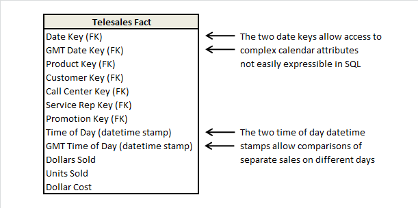
Think Globally, Act Locally

$
0
0
Print Friendly

The global data warehouse introduces a whole new world of design issues 

As soon as the geographic spread of our data warehouse crosses a time zone or a national boundary, a whole host of design issues arise. For the sake of a label, let’s call such a warehouse a global data warehouse, and let’s collect all these design issues in one place. From a designer’s perspective, once the code is open for change, we might as well consider all the design changes for the global data warehouse at once.

Synchronizing Multiple Time Zones

Many businesses measure the exact time of their basic transactions. The most common measured transactions include retail transactions at conventional stores, telephone inquiries at service desks, and financial transactions at bank teller machines. When a business spans multiple time zones, it is left with an interesting conflict. Does it record the times of these transactions relative to an absolute point in time, or does it record the times relative to local midnight in each time zone? Both of these perspectives are valid. The absolute time perspective lets us see the true simultaneous nature of the transactions across our entire business, whereas the local time perspective lets us accurately understand the transaction flow relative to the time of day. In the United States, “everyone” gets off work at 5 p.m., watches the news at 6, and eats dinner at 6:30.

It’s tempting to store each underlying transaction with an absolute timestamp and leave it up to the application to sort out issues of local times. Somehow, this seems to be a conservative and safe thing to do, but I don’t support this design. The database architect has left the downstream application designer with a complicated mess. Doing a coordinated local-time-of-day analysis across multiple time zones is nightmarish if all you have is a single absolute timestamp. Transaction times near midnight will fall on different days. Some states, such as Indiana and Arizona, do not observe daylight savings time. Reversing the design decision and storing the transaction times as relative to local midnight just recasts the same application problem in a different form. What we need instead is a more powerful design.

Figure 1: Timestamp design for businesses with multiple time zones.

The timestamp is recorded simultaneously in both absolute and relative formats. Additionally, I recommend separating the calendar day portions of the timestamps from the time-of-day portions of the timestamps. We end up with four fields in a typical transaction fact table. The two calendar-day fields should be surrogate keys pointing to two instances of a calendar-day dimension table. These key entries in the fact table should not be actual SQL date stamps. Rather, these keys should be simple integers that point to the calendar date dimension table. Using surrogate (integer) keys for the actual join lets us deal gracefully with corrupted, unknown, or hasn’t-happened-yet dates. We split the time of day from the calendar date because we don’t want to build a dimension table with an entry for every minute over the lifetime of our business. Instead, our calendar day dimension table merely has an entry for every day. In any case, we don’t have unique textual descriptors for each individual minute, whereas we do have a rich array of unique textual descriptors for each individual day.

The two time-of-day fields are probably not keys that join to dimension tables. Rather, they are simply numerical facts in the fact table. To constrain such time-of-day facts, we apply BETWEEN constraints to these fields. If we do a lot of these kinds of constraints, it will be helpful to build an index on each of these of these time-of-day fields.

Although this double-barreled design uses a bit more storage space (three extra fields) in the fact table, the application designers will be delighted. Both absolute and relative time analyses will “fall out” of the database, regardless of how many time zones your business spans.

Multiple National Calendars

A multinational business spanning many countries can’t easily keep track of an open-ended number of holidays and seasons across many different countries. As happens so often in database design, there are two different perspectives that we need to address. We need the calendar from the perspective from a single country (is today a holiday in Singapore?) as well as across collections of countries all at once. (Is today a holiday anywhere in Europe?)

Figure 2: Design for an open-ended number of calendars.

The primary calendar dimension contains generic entries independent of any particular country. These entries include weekday names, month names, and other useful navigational fields such as day, week, and month numbers. If your business spans major basic calendar types such as Gregorian, Islamic, and Chinese calendars, then it would make sense to include all three sets of major labels for days, months, and years in this single table.

The calendar dimension I just described provides the basic framework for all calendars, but each country has a small number of unique calendar variations. I like to handle this with a supplementary calendar dimension whose key is the combination of the calendar key from the main calendar dimension together with the country name. Figure 2 also shows this supplementary table. You can join this table to the main calendar dimension or directly to the fact table. If you provide an interface that requires the user to specify the country, then the attributes of the supplementary table can be viewed logically as being appended to the main calendar table, which lets you view you calendar through the eyes of any single country at a time.

You can use the supplementary calendar table to constrain groups of countries. The grouping can be geographic or by any other affiliation you choose for a country (such as Supplier Business Partners). If you choose a group of countries, you can use the EXISTS clause of SQL to determine if any of the countries has a holiday on a particular date.

Collecting Revenue in Multiple Currencies

Multinational businesses often book transactions, collect revenues, and pay expenses in many different currencies.

Figure 3: Multiple currency design.

The primary amount of the transaction is represented in the local currency. In some sense, this is always the “correct” value of the transaction. For easy reporting purposes, a second field in the transaction fact record expresses the same amount in a single global currency, such as United States dollars. The equivalency between the two amounts is a basic design decision for the fact table, and is probably an agreed upon daily spot rate for the conversion of the local currency into the global currency. Now a business can easily add up all transactions in a single currency from the fact table by constraining in the country dimension to a single currency type. It can easily add up transactions from around the world by summing the global currency field.

But what happens if we want to express the value of a set of transactions in a third currency? For this, we need a currency exchange table, also shown in Figure 3. The currency exchange table typically contains the daily exchange rates both to and from each the local currencies and one or more global currencies. Thus, if there are 100 local currencies and three global currencies, we would need 600 exchange rate records each day. It is probably not practical to build a currency exchange table between each possible pair of currencies because for 100 currencies, there would be 10,000 daily exchange rates. It is not likely, in my opinion, that a meaningful market for every possible pair of exchange rates actually exists.

The Euro

As most of you know, many of the European nations (known as the European Union, or EU) are standardizing on a single European currency known as the euro. The euro is significant from a data warehouse point of view; don’t look at it as just another currency. The euro brings with it some specific financial reporting and data warehousing requirements. The most significant requirements are the three currency conversion requirement and the six decimals of precision requirement.

For all currency conversion calculations performed between EU countries, a currency must first be converted into the euro, and then the euro value converted into the second currency. Every currency conversion among EU countries must take this two-step process; you can’t convert directly between currencies. These conversions in the data warehouse, of course, can be implemented from the design of the previous section, where the global currency is assumed to be the euro.

The second mandate is that you must perform all currency conversion calculations with six decimals of precision to the right of the decimal point. The purpose of this requirement is to place a maximum bound on the rounding error of currency conversion calculations. The big issue here is not the exchange factor, but rather the precision of any numeric field that stores a currency valued amount. If any such field truncates or rounds to less than six decimals of precision to the right of the decimal point for any EU currency, then this field cannot be used as a source field for a currency conversion to euros. (Ouch!) You have to make sure that your databases and spreadsheets don’t perform this rounding or truncation implicitly if they have native support for European currencies.

The post Think Globally, Act Locally appeared first on Kimball Group.
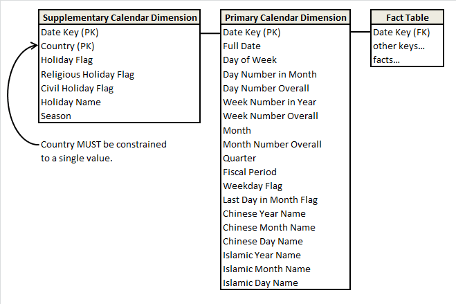

Design Tip #105 Snowflakes, Outriggers, and Bridges

$
0
0
Print Friendly

Students often blur the concepts of snowflakes, outriggers, and bridges. In this Design Tip, I’ll try to reduce the confusion surrounding these embellishments to the standard dimensional model.

When a dimension table is snowflaked, the redundant many-to-one attributes are removed into separate dimension tables. For example, instead of collapsing hierarchical rollups such as brand and category into columns of a product dimension table, the attributes are stored in separate brand and category tables which are then linked to the product table. With snowflakes, the dimension tables are normalized to third normal form. A standard dimensional model often has 10 to 20 denormalized dimension tables surrounding the fact table in a single layer halo; this exact same data might easily be represented by 100 or more linked dimension tables in a snowflake schema.

We generally encourage you to handle many-to-one hierarchical relationships in a single dimension table rather than snowflaking. Snowflakes may appear optimal to an experienced OLTP data modeler, but they’re suboptimal for DW/BI query performance. The linked snowflaked tables create complexity and confusion for users directly exposed to the table structures; even if users are buffered from the tables, snowflaking increases complexity for the optimizer which must link hundreds of tables together to resolve queries. Snowflakes also put burden on the ETL system to manage the keys linking the normalized tables which can become grossly complex when the linked hierarchical relationships are subject to change. While snowflaking may save some space by replacing repeated text strings with codes, the savings are negligible, especially in light of the price paid for the extra ETL burden and query complexity.

Outriggers are similar to snowflakes in that they’re used for many-to-one relationships, however they’re more limited. Outriggers are dimension tables joined to other dimension tables, but they’re just one more layer removed from the fact table, rather than being fully normalized snowflakes. Outriggers are most frequently used when one standard dimension table is referenced in another dimension, such as a hire date attribute in the employee dimension table. If the users want to slice and-dice the hire date by non-standard calendar attributes, such as the fiscal year, then a date dimension table (with unique column labels such as Hire Date Fiscal Year) could serve as an outrigger to the employee dimension table joined on a date key.

Like many things in life, outriggers are acceptable in moderation, but they should be viewed as the exception rather than the rule. If outriggers are rampant in your dimensional model, it’s time to return to the drawing board given the potentially negative impact on ease-of-use and query performance.

Bridge tables are used in two more complicated scenarios. The first is where a many-to-many relationship can’t be resolved in the fact table itself (where M:M relationships are normally handled) because a single fact measurement is associated with multiple occurrences of a dimension, such as multiple customers associated with a single bank account balance. Placing a customer dimension key in the fact table would require the unnatural and unreasonable divvying of the balance amongst multiple customers, so a bridge table with dual keys to capture the many-to-many relationship between customers and accounts is used in conjunction with the measurement fact table. Bridge tables are also used to represent a ragged or variable depth hierarchical relationship which cannot be reasonably forced into a simpler fixed depth hierarchy of many-to-one attributes in a dimension table.

In these isolated situations, the bridge table comes to the rescue, albeit at a price. Sometimes bridges are used to capture the complete data relationships, but pseudo compromises, such as including the primary account holder or top rollup level as dimension attributes, help avoid paying the toll for navigating the bridge on every query.

The post Design Tip #105 Snowflakes, Outriggers, and Bridges appeared first on Kimball Group.
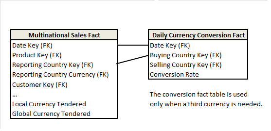
Design Tip #113 Creating, Using, and Maintaining Junk Dimensions

$
0
0
Print Friendly

A junk dimension combines several low-cardinality flags and attributes into a single dimension table rather than modeling them as separate dimensions. There are good reasons to create this combined dimension, including reducing the size of the fact table and making the dimensional model easier to work with. Margy described junk dimensions in detail in Kimball Design Tip #48: De-Clutter with Junk (Dimensions). On a recent project, I addressed three aspects of junk dimension processing: building the initial dimension, incorporating it into the fact processing, and maintaining it over time.

Build the Initial Junk Dimension
If the cardinality of each attribute is relatively low, and there are only a few attributes, then the easiest way to create the dimension is to cross-join the source system lookup tables. This creates all possible combinations of attributes, even if they might never exist in the real world.

If the cross-join of the source tables is too big, or if you don’t have source lookup tables, you will need to build your junk dimension based on the actual attribute combinations found in the source data for the fact table. The resulting junk dimension is often significantly smaller because it includes only combinations that actually occur.

We’ll use a simple health care example to show both of these combination processes. Hospital admissions events often track several standalone attributes, including the admission type and level of care required, as illustrated below in the sample rows from the source system lookup and transaction tables.

The following SQL uses the cross-join technique to create all 12 combinations of rows (4×3) from these two source tables and assign unique surrogate keys.

SELECT ROW_NUMBER() OVER( ORDER BY Admit_Type_ID, Care_Level_ID) AS
Admission_Info_Key,
Admit_Type_ID, Admit_Type_Descr, Care_Level_ID, Care_Level_Descr
FROM Admit_Type_Source
CROSS JOIN Care_Level_Source;

In the second case, when the cross-join would yield too many rows, you can create the combined dimension based on actual combinations found in the transaction fact records. The following SQL uses outer joins to prevent a violation of referential integrity when a new value shows up in a fact source row that is not in the lookup table.

SELECT ROW_NUMBER() OVER(ORDER BY F.Admit_Type_ID) AS
Admission_Info_Key,
F.Admit_Type_ID, ISNULL(Admit_Type_Descr, ‘Missing Description’)
Admit_Type_Descr,
F.Care_Level_ID, ISNULL(Care_Level_Descr, ‘Missing Description’)
Care_Level_Descr — substitute NVL() for ISNULL() in Oracle
FROM Fact_Admissions_Source F
LEFT OUTER JOIN Admit_Type_Source C ON
F.Admit_Type_ID = C.Admit_Type_ID
LEFT OUTER JOIN Care_Level_Source P ON
F.Care_Level_ID = P.Care_Level_ID;

Our example Fact_Admissions_Source table only has four rows which result in the following Admissions_Info junk dimension. Note the Missing Description entry in row 4.

Incorporate the Junk Dimension into the Fact Row Process
Once the junk dimension is in place, you will use it to look up the surrogate key that corresponds to the combination of attributes found in each fact table source row. Some of the ETL tools do not support a multi-column lookup join, so you may need to create a work-around. In SQL, the lookup query would be similar to the second set of code above, but it would join to the junk dimension and return the surrogate key rather than joining to the lookup tables.

Maintain the Junk Dimension
You will need to check for new combinations of attributes every time you load the dimension. You could apply the second set of SQL code to the incremental fact rows and select out only the new rows to be appended to the junk dimension as shown below.

SELECT * FROM ( {Select statement from second SQL code listing} ) TabA
WHERE TabA.Care_Level_Descr = ‘Missing Description’
OR TabA.Admit_Type_Descr = ‘Missing Description’ ;

In this example, it would select out row 4 in the junk dimension. Identifying new combinations could be done as part of the fact table surrogate key substitution process, or as a separate dimension processing step prior to the fact table process. In either case, your ETL system should raise a flag and notify the appropriate data steward if it identifies a missing entry.

There are a lot of variations on this approach depending on the size of your junk dimension, the sources you have, and the integrity of their data, but these examples should get you started. Send me an email if you’d like a copy of the code to create this example in SQL Server or Oracle.

The post Design Tip #113 Creating, Using, and Maintaining Junk Dimensions appeared first on Kimball Group.

Viewing all 17 articles
Browse latest View live